Promotional Artwork • Garyline • 2024-25
PROMO
PRODUCTS
OVERVIEW
During my time at Garyline, I worked with a newly introduced digital printing system capable of producing full-color, wraparound graphics on thousands of bottles daily.
My role expanded beyond production artwork into concept development,
creating designs specifically optimized for this process. I developed & prepared artwork, presentation mockups, and managed projects hrough production to ensure artwork translated accurately onto the final product.
The promo products industry operates on tight timelines, often requiring concept, presentation, and approval within days. Many projects moved from initial design to production within the same week.
I
Promo
Products
MY ROLE
Production Artist Lead
SKILLS USED
-
Adobe Illustrator
-
Adobe Photoshop
-
Brand Application
-
Layout & Composition
-
2D & 3D Rendering
-
Presentation Deck Mockup
-
Prepress Setup
-
Color System Management
-
Industrial Printing
-
Cross-Team Collab.
-
Proofing & Quality Control


fedex peak season '26
Ahead of the holiday rush, themed bottles are printed and distributed to FedEx centers across the country. In November of 2025, I had the chance to design multiple designs; two of which were approved. Under an accelerated timeline, the designs were created, approved, and sent into production within a week.
-
Upwards of $6,000 in total orders over the 2025-26 Holiday Season.
-
Thousands of units produced and shipped.


Perfetti van melle
For Pride Month, I was approached by an ecstatic client who needed swag for his clients at Perfetti Van Melle for an event. Within a day, I delivered the artwork for this design, alongside presentation decks which included mockups and a variety of bottle & lid color combinations. Approval was quickly received, and production of 7,000 units followed after.
-
7,000 units produced and shipped
-
Presentation decks, mockups, colorway options offered to client
-
Artwork later adapted for future merch
NEAU WATER & ART BASEL
Created for Art Basel Miami, this project explored bottle concepts for NEAU Water that could feel more intentional than a typical event giveaway. The goal was to give visitors something visually engaging and worth holding onto.
The final directions balanced bold color and strong visual impact with a more editorial, art-driven approach. Some concepts leaned into bright, eye-catching graphics, while others pulled from classical visual references to create a more layered and unexpected result.
.png)


T-MOBILE
Created for a large T-Mobile event, this project explored bottle concepts designed to stand out in a crowded promotional setting. The goal was to turn a standard giveaway into something more visually immediate and memorable.
The final directions used full-wrap graphics, bold contrast, and simplified forms to create a stronger visual hit. Some concepts leaned more playful and graphic, while others took on a cleaner, more abstract feel.


.png)
CRAYOLA
This was in fact the first project I worked on. Knowing that these bottles would be handed out at Crayola's locations, I leaned heavily into the "who" would be receiving these bottles. Naturally, it would likely be children, so putting drawings and a Question-to-Action on the items came to me as the natural way forward.
A light-hearted, fun item that I imagine could inspire kids to draw, whether recreating what's on the bottle or expressing their imagination.
I'd be remiss in omitting that I have a soft spot for this concept.


.png)
COMPANY MERCH
Trade shows are key events in the promotional product industry, where companies can showcase the best of their latest items. A last-minute, small giveaway was arranged, and these bottles were needed ASAP.
I drew inspiration from landmarks and vintage stamps centered around Chicago.
The designs highlight places of interest, such as the Adler Planetarium, and River Park Towers, and Carbide & Carbon. The "Get Moving" stamp, prominent on the top, is a nod to Chicago's public transport system - so is the one below it, with the tagline "A City That Works," - a quote from Mayor Richard J. Daley.
Needless to say, the bottles were done, produced, and shipped within a week, and handed out in kind. As a New Yorker who has always looked at Chicago as the "only other [real] city in America," this was a lot of fun to work on.


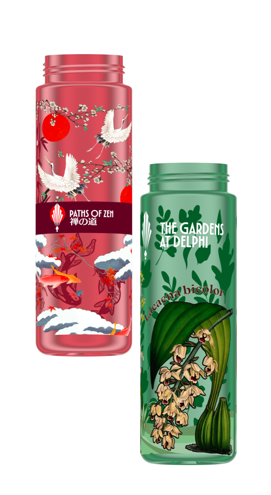
SAMPLES
These two designs were made for a specific purpose. I was often approached by clients who were unsure of how to approach printing with the full-wrap method. By the time these were made, I had accumulated a year's worth of intimate knowledge on this specific process - what works, and what doesn't.
So that is exactly what these were made for - to show how far one could comfortably go with printing. I would show these bottles to clients to explain a few core ideas: for example, printing a tone-on-tone to create depth, and the important of negative space (being able to see-thru the bottle).
Both bottles are for a fictitious "Gardens of Delphi," which so far must include a botanical garden and a Japanese Zen Garden.
The green bottle features illustrations inspired by Pierre-Joseph Redouté.